Investigating neighbourhood legibility with open data
We teamed up with Applied Information Group to discover how we might use data to analyse neighbourhood 'legibility'. Kevin Lynch, back in 1960, defined legibility as “the ease with which [the cityscape] parts can be recognised and can be organised into a coherent pattern”. We took data from OpenStreetMap and used Diagonal’s geospatial analysis engine to explore the edges of data-driven diagnosis of what makes urban spaces easier or more difficult to navigate as a pedestrian.
Applied helps millions of people navigate cities and places. They create information systems which operate as ‘choice architecture’ for nudging decisions, broadening horizons and enriching experiences - in familiar and new environments. “Their passion is to help people move through busy places easily, productively and with certainty. They make journeys effortless by better explaining environments and making them more intuitive and memorable – more legible.”
"A distinctive and legible environment not only offers security but also heightens the potential depth and intensity of human experience." - “The Image of the City” by Kevin Lynch 1960
Applied have identified several wayfinding influences, based on years of experience helping people navigate in cities like London, Madrid and New York. These influences represent environmental, built environment and human factors that impact how people travel through and explore spaces. They help predict the results of different wayfinding. We experimented with quantitative, scalable approaches to several influences.
We used our own geospatial analysis engine for the investigations, which we’re in the process of making available under an open-source license. In this post we’ll share our discoveries about two.
Sightlines
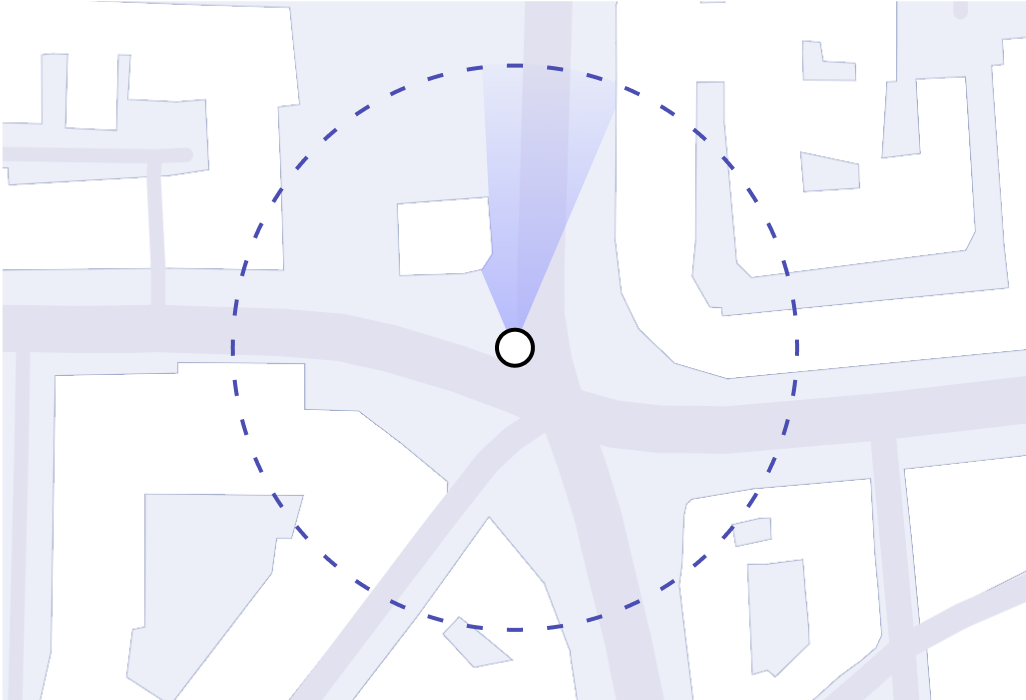
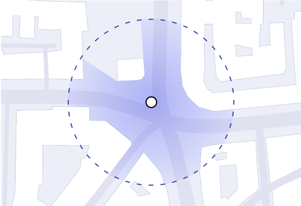
How far and what can you see when you stand in a
particular spot on the street?
Landmark neighbourhoods
What areas in the city are less than a 500m from a
specific landmark?
Sightlines
The experience of walking in the city is largely defined by what you see, or can’t see, around you at each point in your journey. When sightlines are obscured, orienting yourself becomes more difficult. Cities may benefit from navigation support focused in areas with low sightline visibility.
We wrote code to roughly estimate the area visible to pedestrians from a given point. Using our analysis engine, we calculated these sightline polygons for all outdoor spaces around St. Paul's Cathedral. We then used these sightline polygons to identify areas of limited visibility, which may be difficult for pedestrians to navigate and require more explicit wayfinding support.
We based our approach on buildings from OpenStreetMap, using a two-dimensional representation of the world, and assuming people had an unrestricted sight horizon of around 100m. We computed sightlines for every point on a ~3m grid, yielding around 200,000 polygons.
Looking at the size and shape of these sightline polygons allows us to perform a more nuanced analysis of the different spaces we encounter as we walk down the street. It gives us insight into the limiting factors of this sightline. Is it long and rectangular or is it wide on one side? Its shape has a physical meaning. What types of buildings and businesses can you see? Could a pattern of shapes be correlated with safer bicycle routes? Could certain shapes encourage exploration while others hinder it?
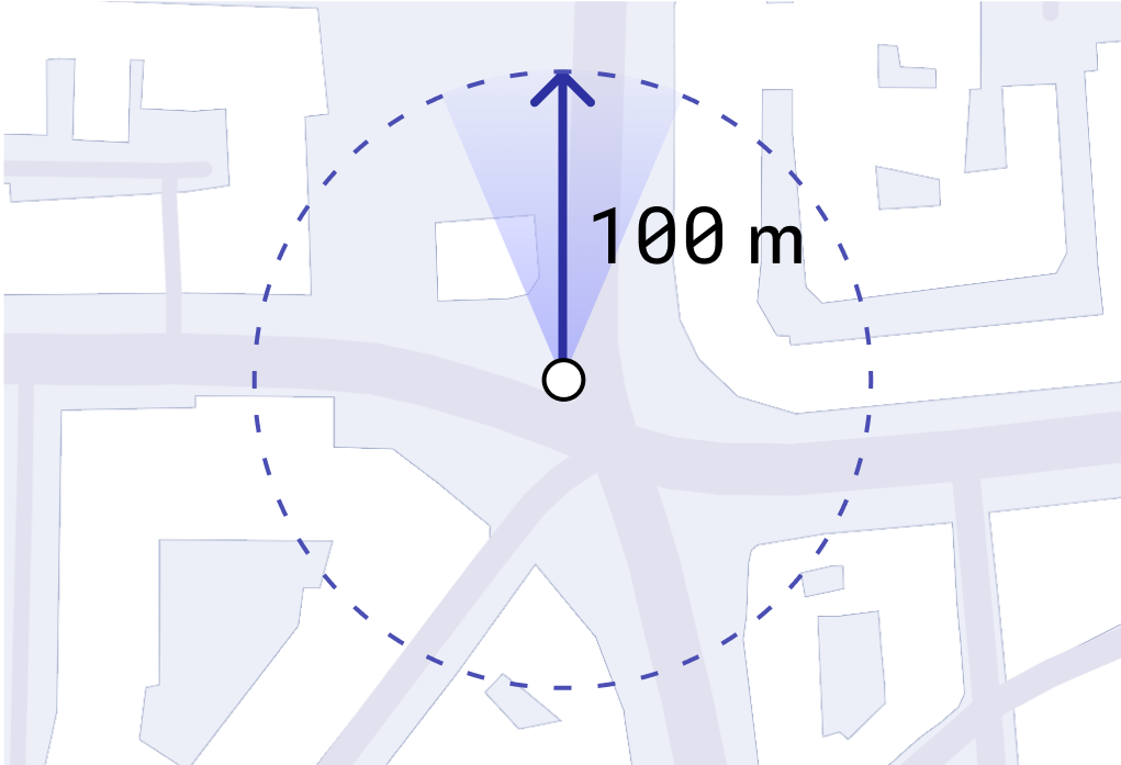
We set a maximum limit to how far someone can see (in our case - 100m).
We assume any building, regardless of height, obstructs the sight line.
We calculate analysis for all directions someone could face, at any point (360º).
Sightlines approaching St Paul's
Cathedral 
Drag the marker to simulate walking down the street
Here we represent the relative visibility of London from a pedestrian’s perspective. The darker-red colour represents greater visibility, computed as the ratio of the area of the sightline polygon to the area of a sightline without obstructions.
City of London - Sightlines
0.3ha
1.5ha
The data behind this map, hundreds of thousands of sightline polygons, would be impossible to compute and view in most GIS tools - not that visualising them all at once would be useful. You could try taking a more sophisticated approach loading in the city data and using a collection of Python libraries to compute the polygons and their areas, writing some code to visualise it all - maybe as you go, or just the end result. Doing so would probably take a considerable amount of time between starting to write your analysis and having a useful visualisation. This hinders your ability to modify and tune your approach, if nothing else, due to time limitations, but most likely due to memory and computation too. This is the space in which our geospatial engine sits, letting us efficiently compute and visualise, making city-wide analysis possible.
Exploring pedestrian visibility for wayfinding is only one use of this kind of data that we investigated - we’re also looking at storefront visibility, and the impact of buildings on citizen wind sensors.
Landmark neighbourhoods
Landmarks have a unique impact on the way people walk about a city. They can be the destination themselves, or be used for orientation. According to Applied’s research, navigating through a landmark-scarce city is likely to be harder than a landmark-rich city. Understanding which areas of the city lack recognisable landmarks can be a way to identify, early on, which areas to focus on when trying to improve the legibility of a space.
We wanted an overview of which areas in London are relatively landmark-rich and landmark-scarce. We did this by computing all the buildings reachable within a 500m walk of a landmark. This collection of reachable buildings form, what we call, landmark-neighbourhoods.
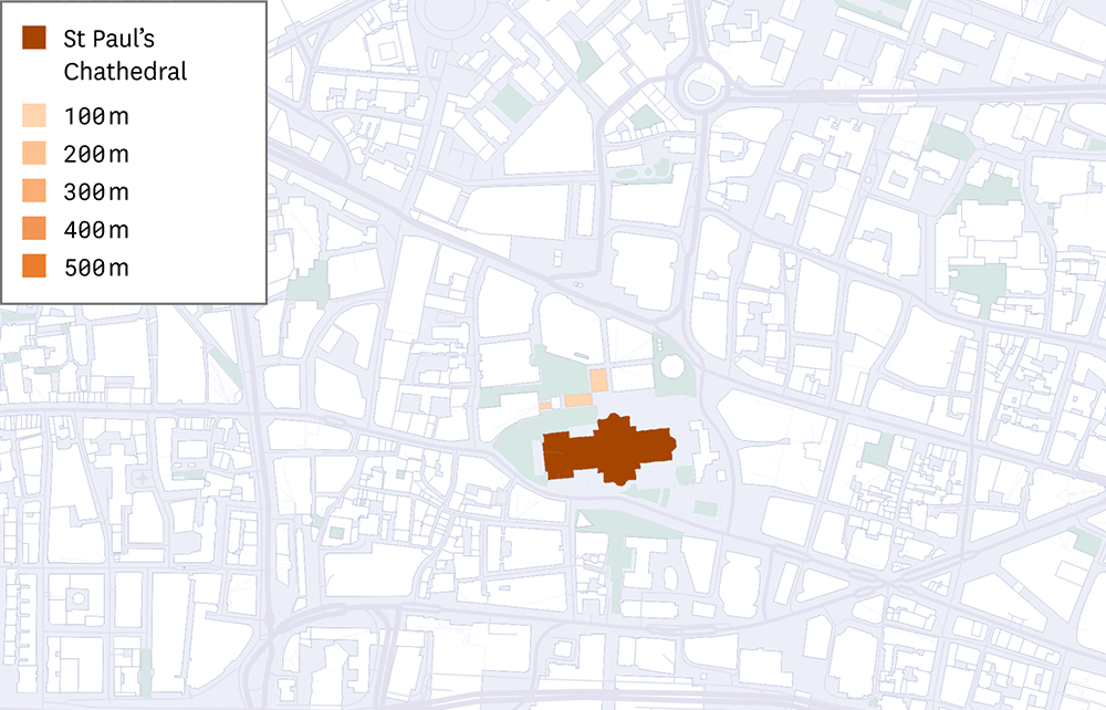
Landmark Neighbourhoods
Computing these paths is computationally heavy, and relies on the underlying network (the paths where you can walk) to be clean and traversable. Our engine allows us to do this efficiently, using a world model based on OSM data in which all buildings are connected to transportation networks. Given our context, we selected the landmarks that Legible London highlights in 3D, though our engine allows this to be easily changed and new analyses to be computed quickly. We visualised all of London to outline landmark-poor parts where alternative navigation cues might benefit people trying to orient themselves in the city.
Moving away from legibility, we can conceive of neighbourhoods being defined by other centres: main-streets, hospitals, schools, a new housing estate, etc. Understanding the density and overlap of the reach of these centres, can help identify especially deprived gaps. If cities are interested in achieving a 15 (or 5, or 1) minute city vision, it’s important to understand how that neighbourhood looks and changes, down to each building. If you live in a building - what amenities are available, what access do you have to healthcare, or to green space, and how does that change if you live in a building over there? Is the availability equitable, can we quantify its differences?
What's next
Our geospatial analysis engine was able to compute and visualise wayfinding influences, driven by data. Data alone is not able to fully describe the feeling of walking through a city, but wrapped in analysis, it can help drive the strategy of what spaces will be particularly challenging to navigate and therefore benefit from enhanced navigation help.
Our engine allows us to perform complex geospatial operations fast and to visualise as we analyse. We believe our tools open the door to ask - and answer - questions we couldn’t before. We bring data to your ideas for positive change, exploring their impact on the city. If you have a project that would benefit from the robust, reliable, realtime data infrastructure and visualisations - get in touch.