Unpacking complexity - Our approach to visualisation
In our work, we analyse relationships between different features of the built environment. We start from questions like: “How might we explore the legibility of a space?” or “How might we calculate how obstructed these weather sensors are?” and we end with a visualisation of the data analysis results. Our aim is to unpack as much of the complexity as possible, not abstract away from it or oversimplify. We believe this leads to more transparency of the data analysis process and a better understanding of trade-offs when it comes to analysing complex systems in cities.
We recently completed a collaboration with Hassell, where we looked at how we might understand the impact of a green corridor in terms of accessibility. In this blogpost we want to talk about some of the design decisions that went into the corridor visualisation, and our approach to visualisation more broadly.
Our process
At Diagonal, visualisation is a process that runs parallel to the analysis process, it builds on each twist and turn of the analysis model, evolving through each of its iterations. Our engine allows us to see the relationships we’re exploring on the map, at each step. This in turn sparks ideas about what questions we could ask next. We can identify comparisons that are important to communicate visually.
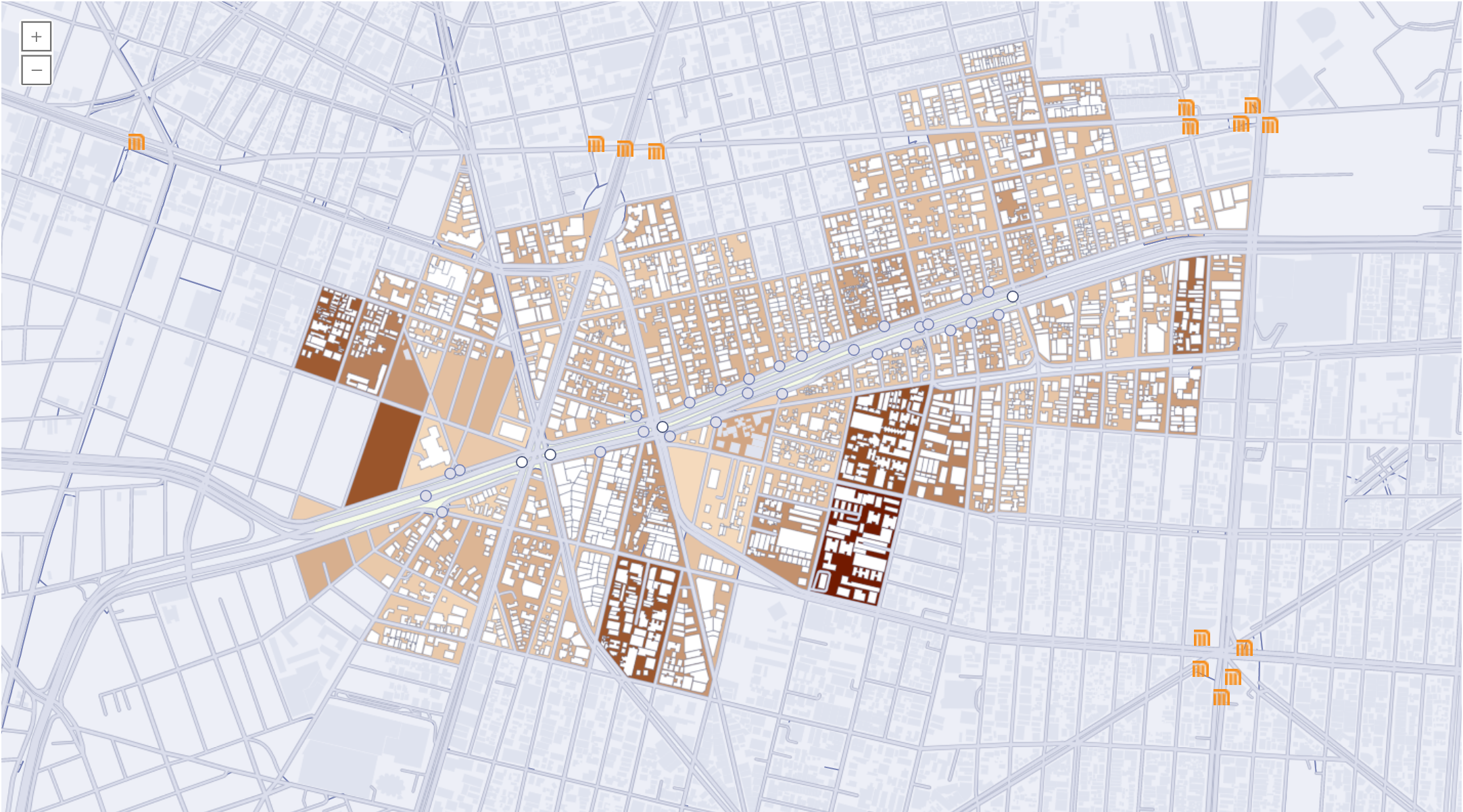
A possible corridor design with 4 gates. The blocks accessible within a 500m walk are colour coded based on the total population reached.
We are a multidisciplinary team and our design process really draws on our diversity. It involves a lot of pairing (eg. between the data scientist and the designer) and discussion to get to the interesting, juicy details that we can each see, drawing from our particular domain knowledge, and experiences.
Our goal is to enable experts (be it domain experts, or local experts - such as community members) to explore data analysis of complex city systems. This means that our deliverables always involve some form of data exploration tool, supported by an interactive map. As we start seeing analysis outputs, we map a rough journey through these results and find the important elements that we would like to highlight visually. In the corridors example, those elements were:
- What are the possible corridor designs optimising for?
- What gates are open within each possible design?
- What blocks are accessible, within a 500m walk, from each possible design?
- What blocks are accessible, within a 500m walk, from each gate?
- How do possible designs compare to each other in terms of population reached?
- How do gates compare in terms of proximity to transport?
From these, visual groupings start to emerge, for example: a ‘possible designs’ view and a ‘gate’ view. It also gives us an idea of the kinds of graphs we can use to explore different design objectives.
What’s the loop?
While mapping the journey we look for interesting exploration loops. For example - let’s say someone is looking at a possible corridor design that looks good, and notices a gate that gives access to a particularly desirable distribution of people. They could then ask, “What other possible corridor designs contain this gate? How do those “score” in terms of cost and total population served? In our design iterations, we look at: What can we pair visually to enable that exploration loop, so that people can make that connection? In our case, this meant creating a matrix of gates, to show which gates are present in each possible design.
Distilling down
The next step is to understand the most efficient, clear and engaging way to deliver this information visually. How do we condense the number of visual elements, and make them as data rich as possible? For this visualisation, that meant showing the numbers for the different population breakdowns (total population reached, senior population, children, etc) in one interactive chart, aligned with the possible designs.
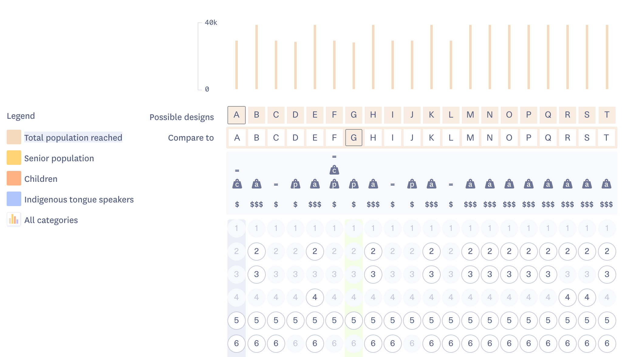
The chart section of the visualisation. Users can compare possible designs in terms of accessibility for different population segments.
Creating shortcuts for quick exploration
What visual “objects” can we give the user to manipulate so that they can quickly make connections: in our case - a way to compare 2 possible designs on the map. In the data tool this meant duplicating the possible designs over 2 rows, for easy selection. In the map, it meant highlighting the blocks unique to each possible design, and visually deprioritising the blocks they have in common.
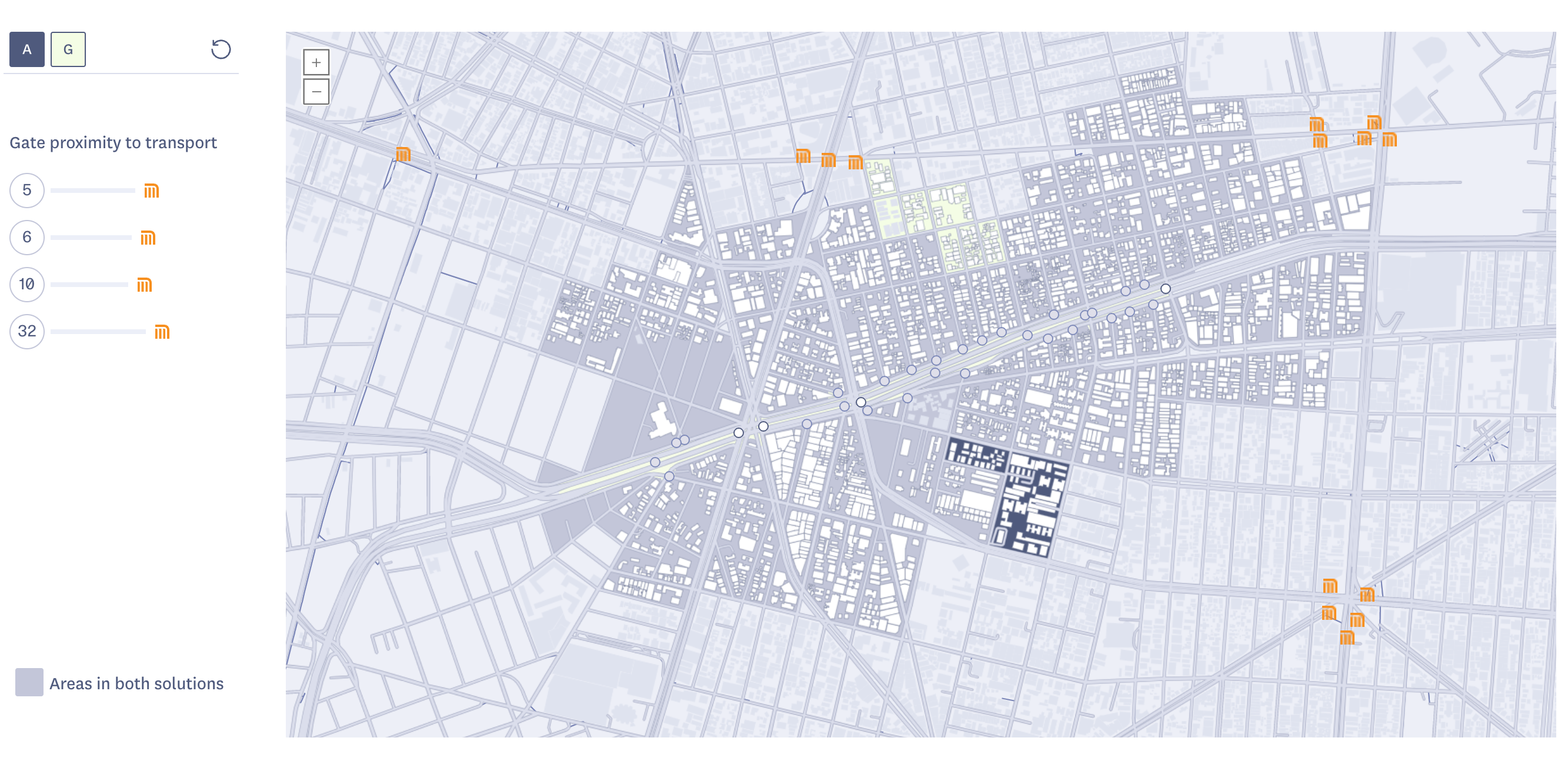
Map view comparing 2 possible designs, A and G. Users can see the areas accessbile in both designs, and the areas accessile only from A or G.
Unpack the analysis model
We are firm believers in a collaborative approach to data analysis. This means working closely with domain experts who use data analysis as a tool, not necessarily do data analysis themselves. To avoid creating black box algorithms, we find visual ways to explain how we arrive at these analysis results. In this case, this meant having a diagram that showed the steps in the analysis, the inputs and outputs. This also served as a way to introduce visual symbols used in the data exploration tool.
Experimenting and testing
We want our visualisations to be as easy to use and intuitive as possible. But we appreciate that trying novel formats to explore geospatial data analysis brings with it the risk of users needing to spend some time with the visual to engage fully with it. By delivering consulting work alongside our product development, we test our tooling against a diverse set of concrete problems. Our visualisations evolve and change with each use case.
By making visualisation a part of the process of analysis, data scientists can place explainability and transparency at the core of their practice. Making the results of analysis explorable in a visual way can open up avenues for wider participation in the design of cities.
If you have a project where you think analytics could help make better decisions, and you are keen to co-create algorithms that derive from your domain expertise, and develop visualisations that let you explore the possibilities, get in touch: hello@diagonal.works